반응형
CSS2 -> CSS3(advanced)
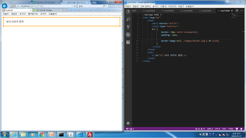
css.27 border 이미지
<!doctype html />
<html lang="ko">
<head>
<meta charset="utf-8"/>
<style type="text/css">
#i1 {
border: 10px solid transparent;
padding: 15px;

border-image:url('./images/border.png') 30 stretch;
}
</style>
</head>
<body>
<p id="i1">보더 이미지 영역</p>
</body>
</html>
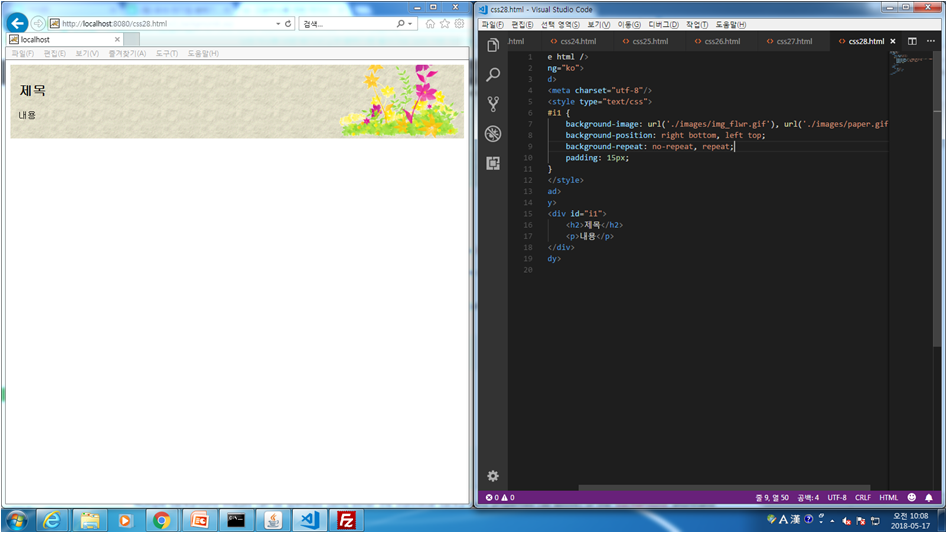
css.28 Multiple Background
<!doctype html />
<html lang="ko">
<head>
<meta charset="utf-8"/>
<style type="text/css">
#i1 {
background-image: url('./images/img_flwr.gif'), url('./images/paper.gif');
background-position: right bottom, left top;
background-repeat: no-repeat, repeat;
padding: 15px;
}
</style>
</head>
<body>
<div id="i1">
<h2>제목</h2>
<p>내용</p>
</div>
</body>
</html>
css.29 Multiple Background + text
<!doctype html />
<html lang="ko">
<head>
<meta charset="utf-8"/>
<style type="text/css">
#i1 {
background: url('./images/img_tree.png') left top no-repeat,
url('./images/img_flwr.gif') right bottom no-repeat,
url('./images/paper.gif') left top repeat;
padding: 15px;
background-size: 50px, 130px, auto;
}
</style>
</head>
<body>
<div id="i1">
<h1>Lorem Ipsum Dolor</h1>
<p1>Lorem ipsum dolor sit amet, consectetuer adipiscing elit, sed diam nonummy nibh euismod tincidunt ut laoreet dolore magna aliquam erat volutpat.</p1>
<p>Ut wisi enim ad minim veniam, quis nostrud exerci tation ullamcorper suscipit lobortis nisl ut aliquip ex ea commodo consequat.</p>
</div>
</body>
</html>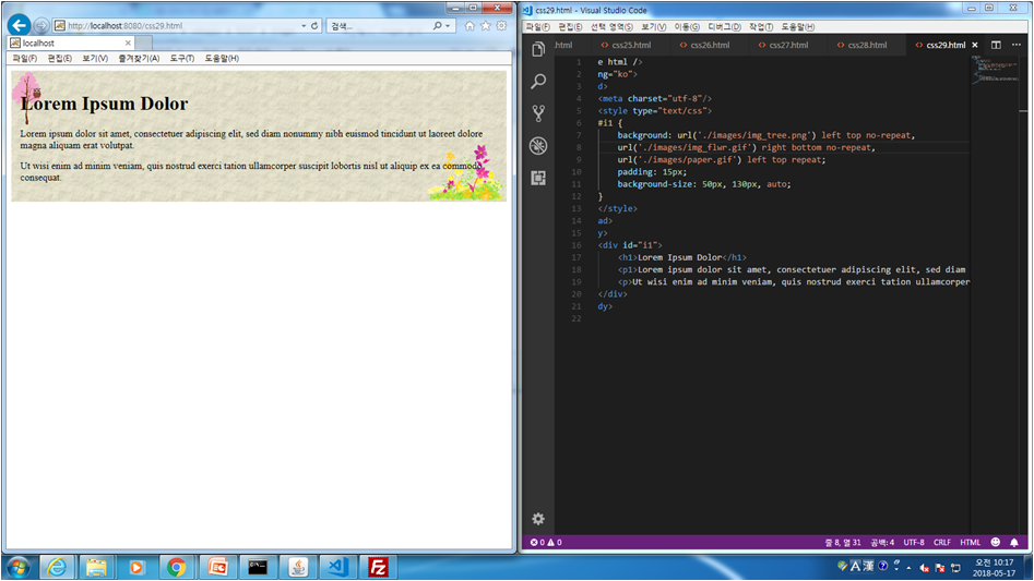
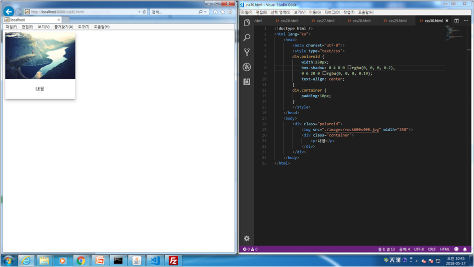
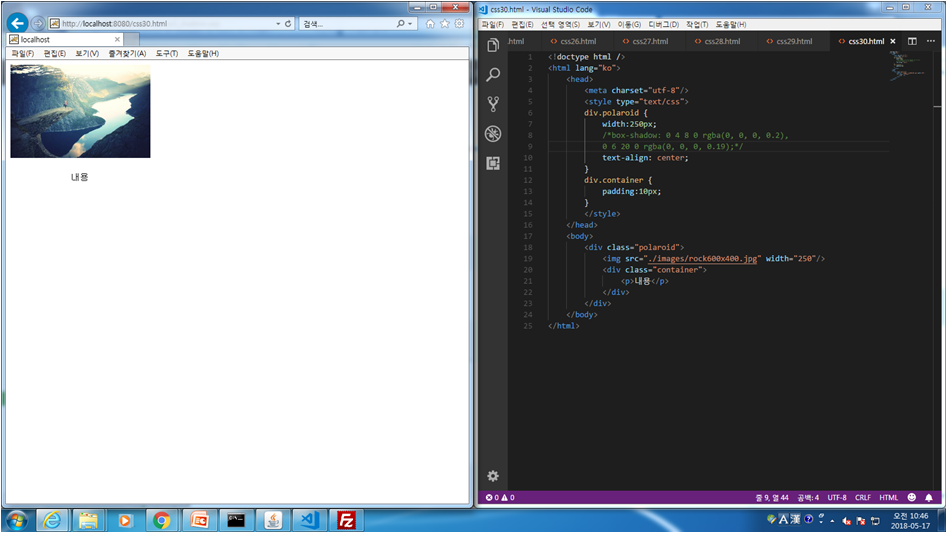
css.30 Gradeint Background
<!doctype html />
<html lang="ko">
<head>
<meta charset="utf-8"/>
<meta name="viewport" content="width=device-width, initial-scale=1.0"/>
<style type="text/css">
div.polaroid {
width:250px;
box-shadow: 0 4 8 0 rgba(0, 0, 0, 0.2),
0 6 20 0 rgba(0, 0, 0, 0.19);
text-align: center;
}
div.container {
padding:10px;
}
</style>
</head>
<body>
<div class="polaroid">
<img src="./images/rock600x400.jpg" width="250"/>
<div class="container">
<p>내용</p>
</div>
</div>
</body>
</html>
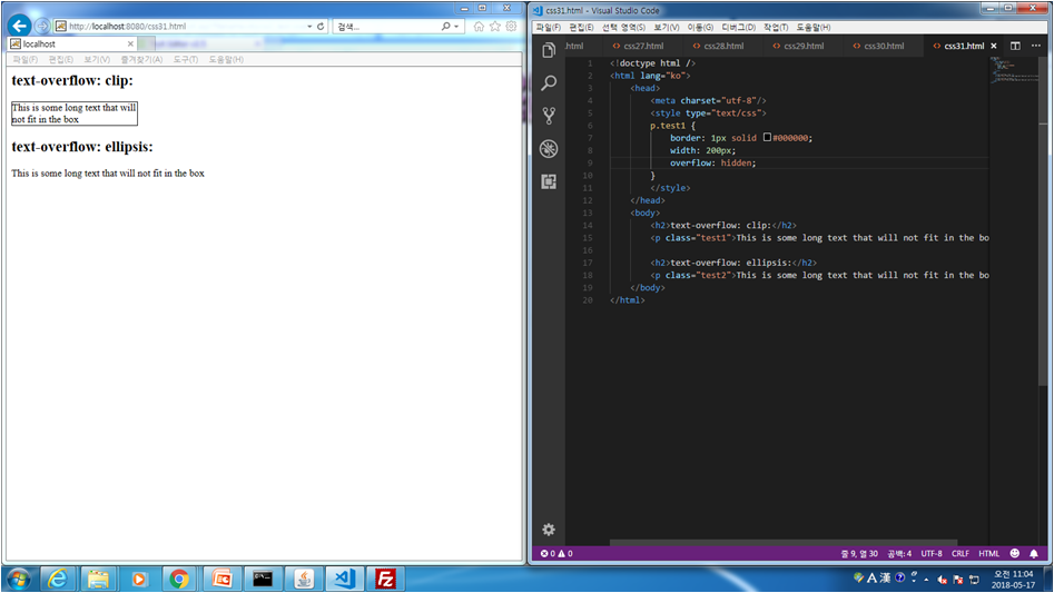
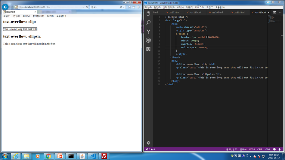
css.31 Text Effects
<!doctype html />
<html lang="ko">
<head>
<meta charset="utf-8"/>
<style type="text/css">
p.test1 {
border: 1px solid #000000;
width: 200px;
overflow: hidden;
white-space: nowrap;
text-overflow: ellipsis;
}
</style>
</head>
<body>
<h2>text-overflow: clip:</h2>
<p class="test1">This is some long text that will not fit in the box</p>

<h2>text-overflow: ellipsis:</h2>
<p class="test2">This is some long text that will not fit in the box</p>
</body>
</html>


css32. Font-Face
<!doctype html />
<html lang="ko">
<head>
<meta charset="utf-8"/>
<style type="text/css">
/*
Tip: Always use lowercase letters for the font URL.
Uppercase letters can give unexpected results in IE.
*/
@font-face {
font-family: myFont;
src: url('./images/sansation_light.woff');
}
#d2 {
font-family: myFont;
}
</style>
</head>
<body>
<div id="d1">한글이다. Hello Font test</div>
<div id="d2">한글이다. Hello Font test</div>
</body>
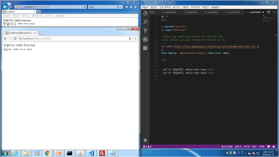
</html>css33. Web Font
<!doctype html />
<html lang="ko">
<head>
<meta charset="utf-8"/>
<style type="text/css">
/*
Tip: Always use lowercase letters for the font URL.
Uppercase letters can give unexpected results in IE.
*/
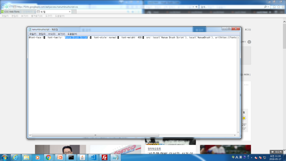
@import url('https://fonts.googleapis.com/earlyaccess/nanumbrushscript.css');
#d2 {
font-family: 'Nanum Brush Script'; font-size: 20px;
}
</style>
</head>
<body>
<div id="d1">한글이다. Hello Font test</div>
<div id="d2">한글이다. Hello Font test</div>
</body>
</html>

https://fonts.googleapis.com/earlyaccess/nanumbrushscript.css
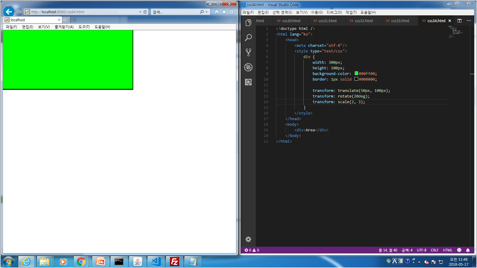
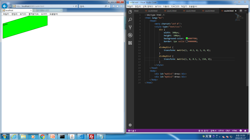
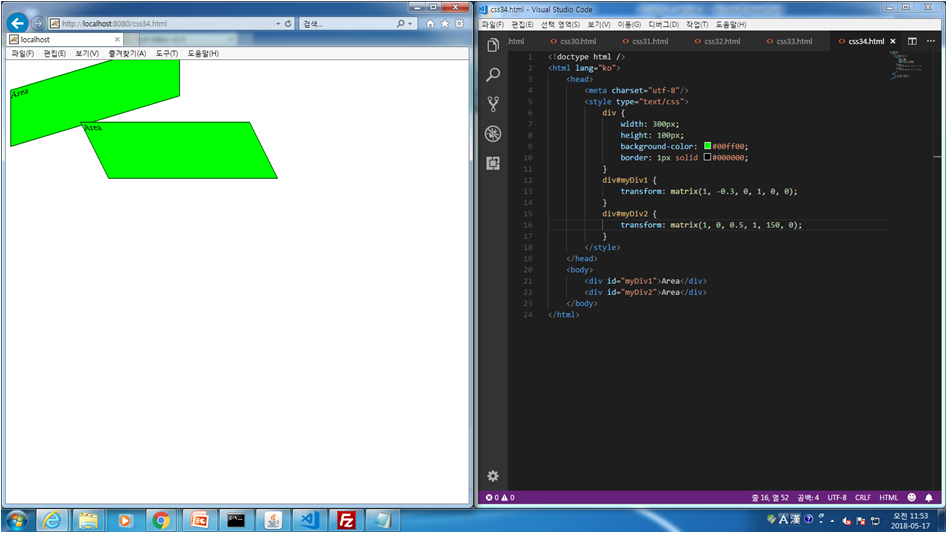
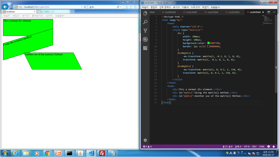
css.34 2D Transform
<!doctype html />
<html lang="ko">
<head>
<meta charset="utf-8"/>
<style type="text/css">
div {
width: 300px;
height: 100px;
background-color: #00ff00;
border: 1px solid #000000;
}
div#myDiv1 {
transform: matrix(1, -0.3, 0, 1, 0, 0);
}
div#myDiv2 {
transform: matrix(1, 0, 0.5, 1, 150, 0);
}
</style>
</head>
<body>
<div id="myDiv1">Area</div>
<div id="myDiv2">Area</div>
</body>
</html>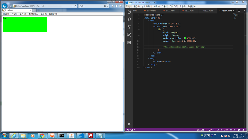
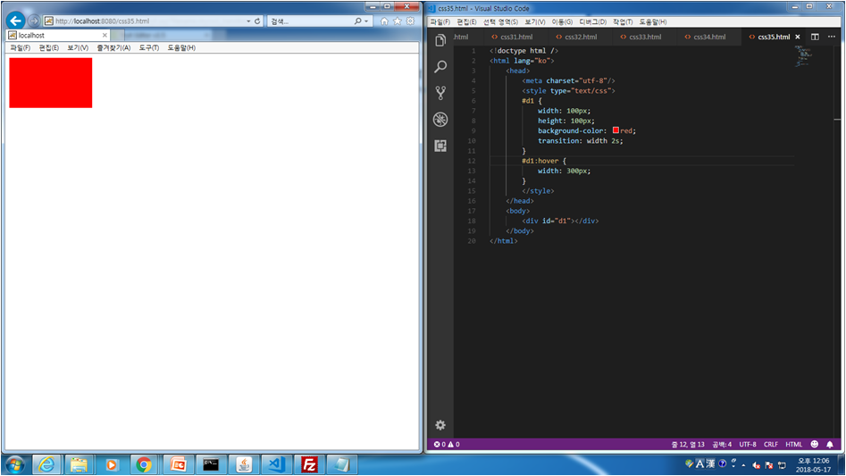
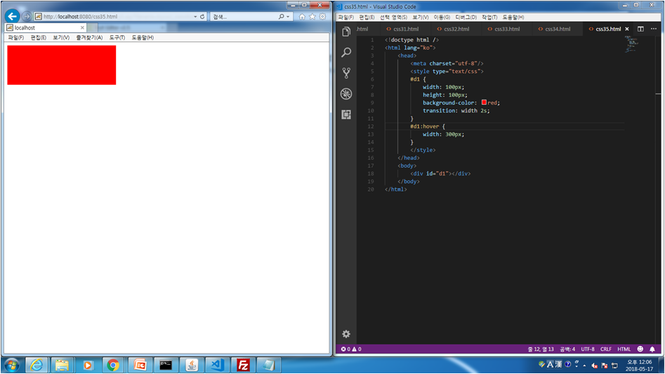
css.35 Transition Property
<!doctype html />
<html lang="ko">
<head>
<meta charset="utf-8"/>
<style type="text/css">
#d1 {
width: 100px;
height: 100px;
background-color: red;
transition: width 2s;
}
#d1:hover {
width: 300px;
}
</style>
</head>
<body>
<div id="d1"></div>
</body>
</html>
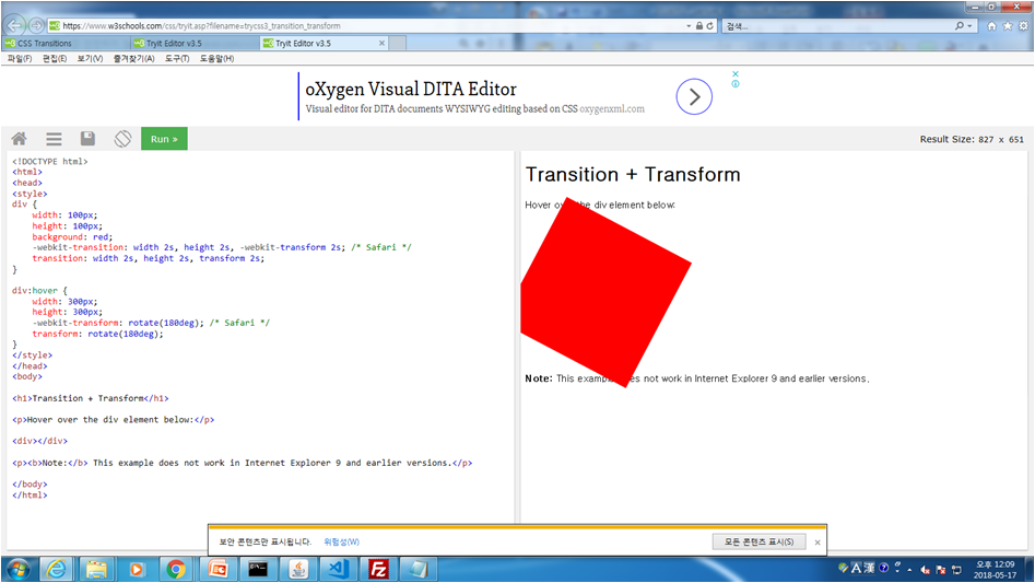
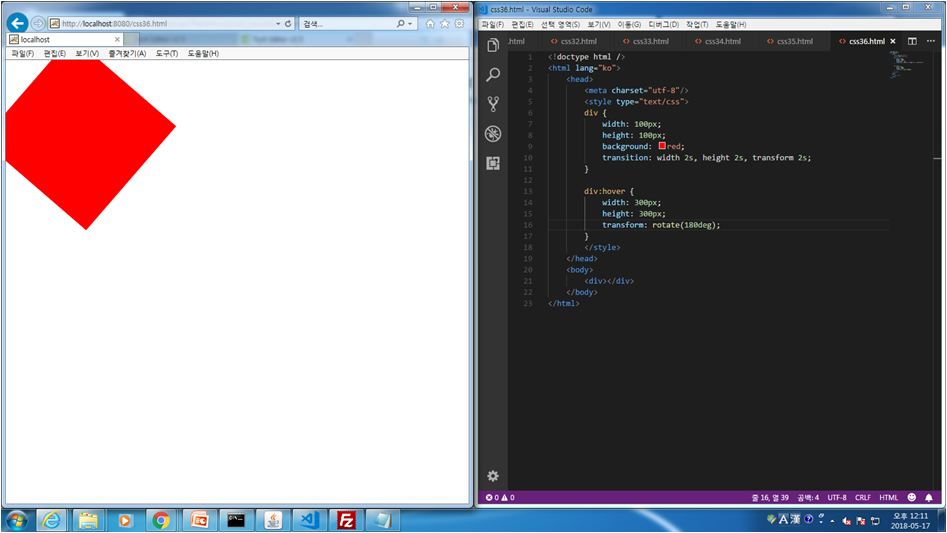
css.36 Transition+Transfrom
<!doctype html />
<html lang="ko">
<head>
<meta charset="utf-8"/>
<style type="text/css">
div {
width: 100px;
height: 100px;
background: red;
transition: width 2s, height 2s, transform 2s;
}

div:hover {
width: 300px;
height: 300px;
transform: rotate(180deg);
}
</style>
</head>
<body>
<div></div>
</body>
</html>
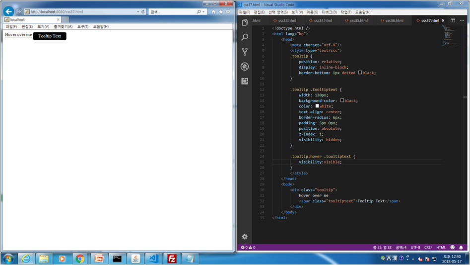
css.37 Tooltips - hover over me
<!doctype html />
<html lang="ko">
<head>
<meta charset="utf-8"/>
<style type="text/css">
.tooltip {
position: relative;
display: inline-block;
border-bottom: 1px dotted black;
}

.tooltip .tooltiptext {
width: 120px;
background-color: black;
color: white;
text-align: center;
border-radius: 6px;
padding: 5px 0px;
position: absolute;
z-index: 1;
visibility: hidden;
}

.tooltip:hover .tooltiptext {
visibility:visible;
}
</style>
</head>
<body>
<div class="tooltip">
Hover over me
<span class="tooltiptext">Tooltip Text</span>
</div>
</body>
</html>
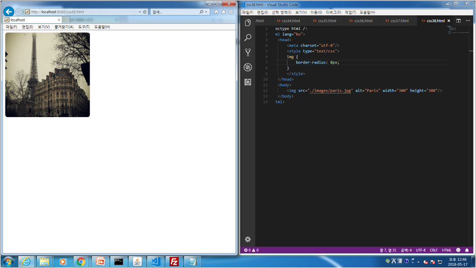
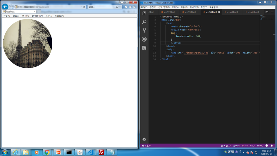
css.38 Styling Images - rounded images, opacity
<!doctype html />
<html lang="ko">
<head>
<meta charset="utf-8"/>
<style type="text/css">
img {
border-radius: 50%;
}
</style>
</head>
<body>
<img src="./images/paris.jpg" alt="Paris" width="300" height="300"/>
</body>
</html>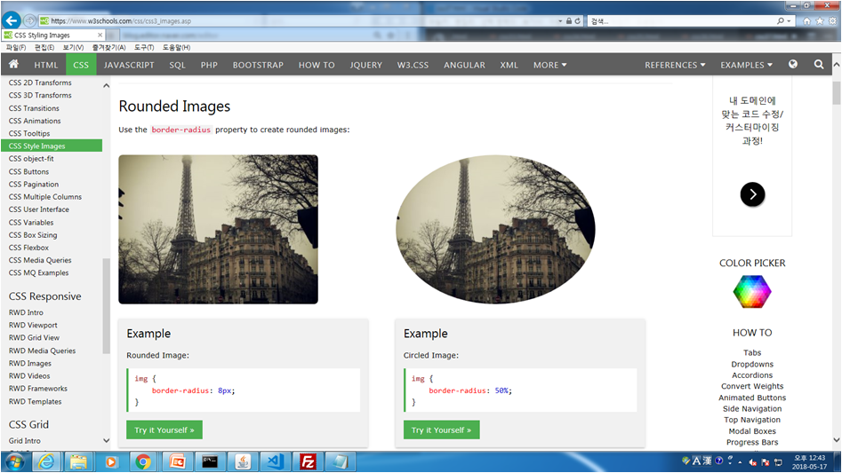
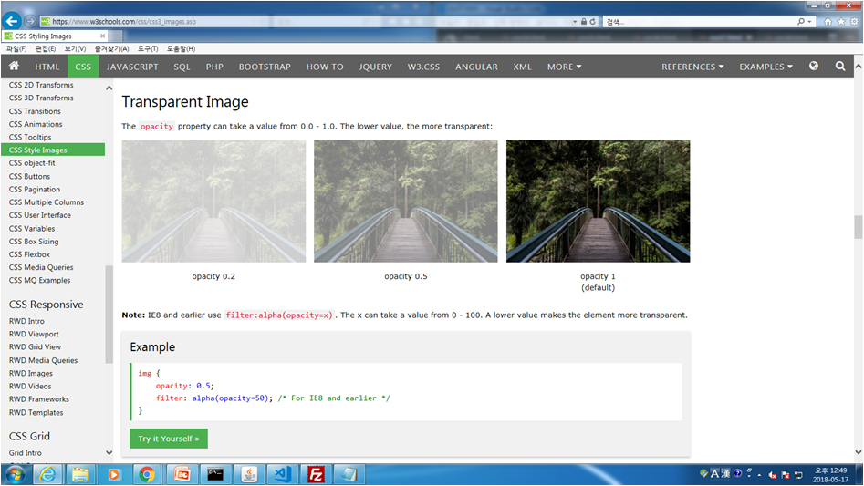
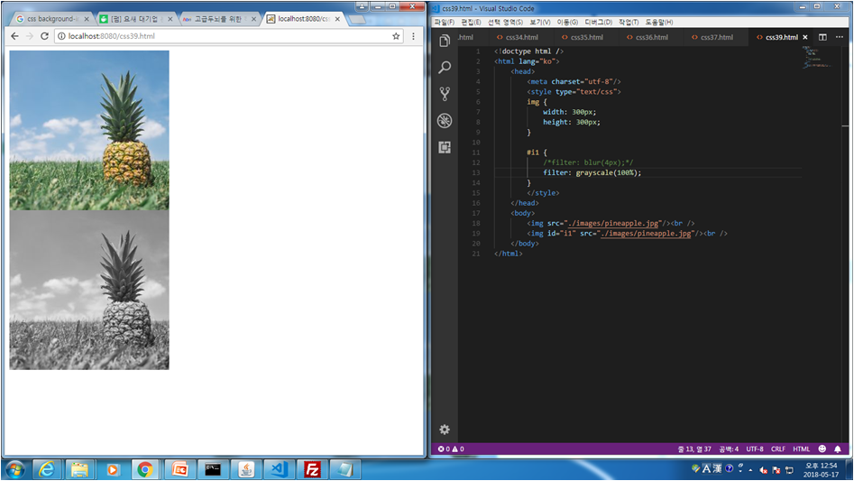
css.39 Styling Images - filter
<!doctype html />
<html lang="ko">
<head>
<meta charset="utf-8"/>
<style type="text/css">
img {
width: 300px;
height: 300px;
}

#i1 {
/*filter: blur(4px);*/
/*filter: grayscale(100%);*/
filter: sepia(100%);
}
</style>
</head>
<body>
<img src="./images/pineapple.jpg"/><br />
<img id="i1" src="./images/pineapple.jpg"/><br />
</body>
</html>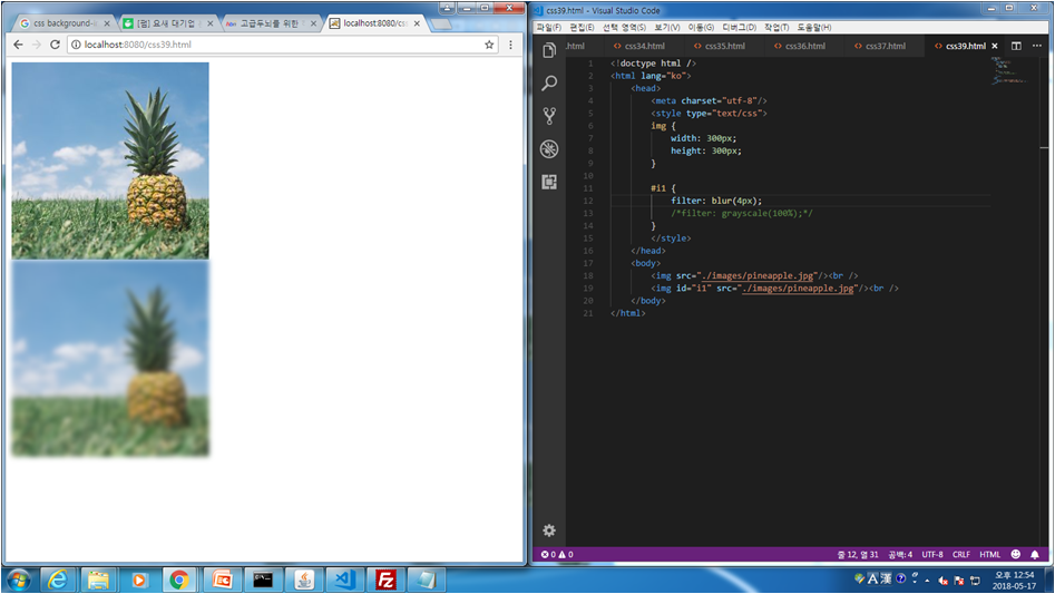
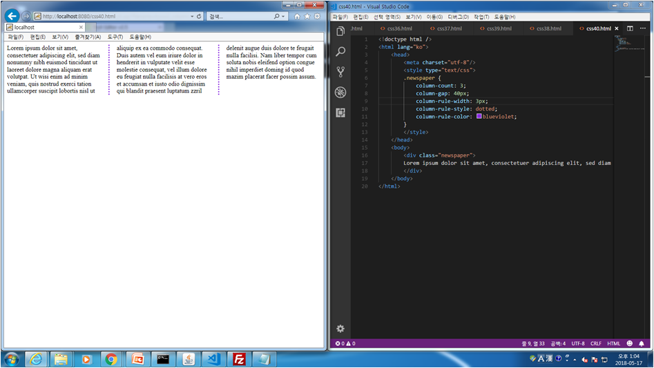
css.40 Multiple Column Properties
<!doctype html />
<html lang="ko">
<head>
<meta charset="utf-8"/>
<style type="text/css">
.newspaper {
column-count: 3;
column-gap: 40px;
column-rule-width: 3px;
column-rule-style: dotted;
column-rule-color: blueviolet;
}
</style>
</head>
<body>
<div class="newspaper">
Lorem ipsum dolor sit amet, consectetuer adipiscing elit, sed diam nonummy nibh euismod tincidunt ut laoreet dolore magna aliquam erat volutpat. Ut wisi enim ad minim veniam, quis nostrud exerci tation ullamcorper suscipit lobortis nisl ut aliquip ex ea commodo consequat. Duis autem vel eum iriure dolor in hendrerit in vulputate velit esse molestie consequat, vel illum dolore eu feugiat nulla facilisis at vero eros et accumsan et iusto odio dignissim qui blandit praesent luptatum zzril delenit augue duis dolore te feugait nulla facilisi. Nam liber tempor cum soluta nobis eleifend option congue nihil imperdiet doming id quod mazim placerat facer possim assum.
</div>
</body>
</html>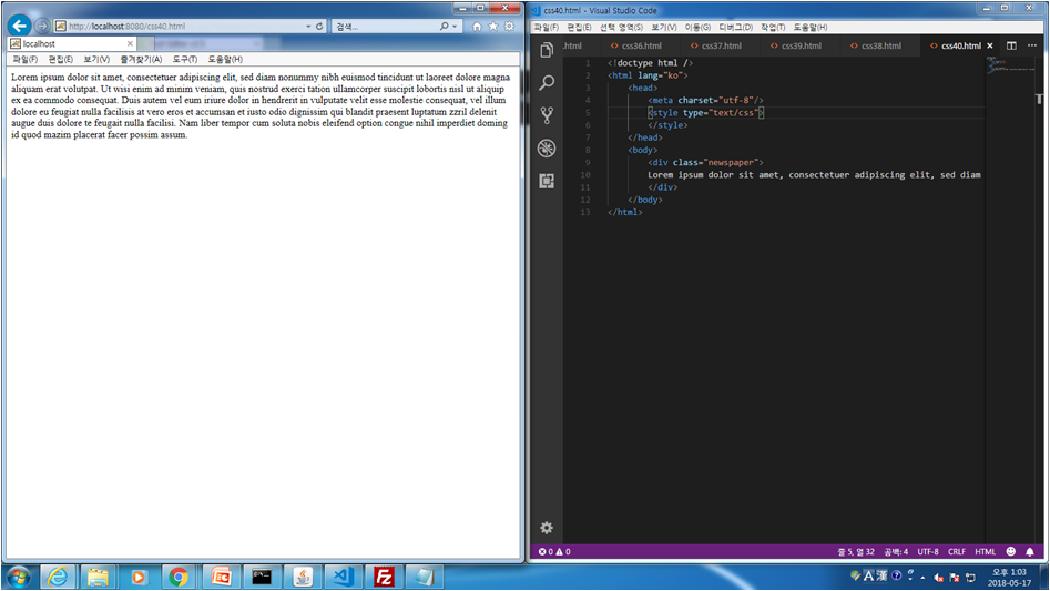


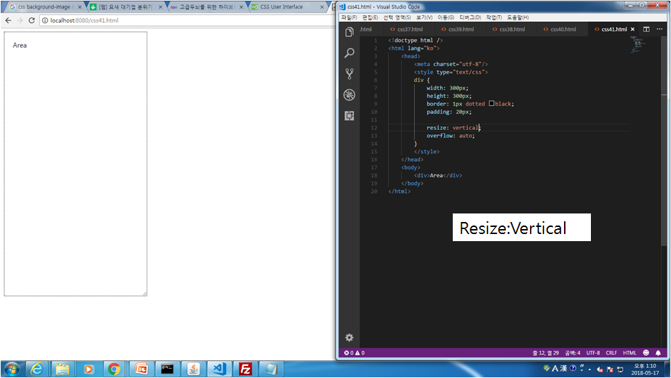
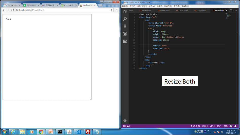
css.41 User Interfaces - Resizing
<!doctype html />
<html lang="ko">
<head>
<meta charset="utf-8"/>
<style type="text/css">
div {
width: 300px;
height: 300px;
border: 1px dotted black;
padding: 20px;

resize: both;
overflow: auto;
}
</style>
</head>
<body>
<div>Area</div>
</body>
</html>

반응형
'Web & Mobile > CSS' 카테고리의 다른 글
| Lecture 3 - CSS(1) (0) | 2019.04.12 |
|---|

댓글